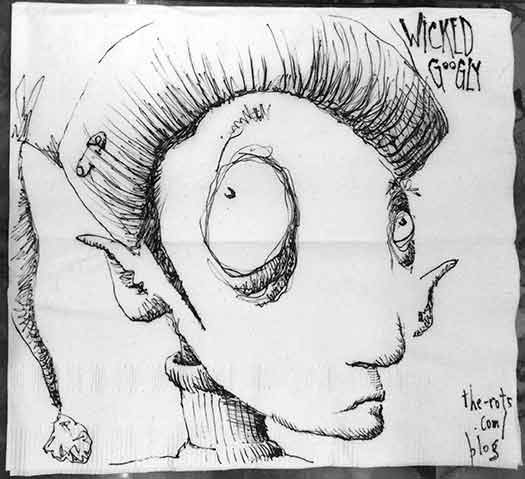
My napkin @ The Wicked Googly
209 W Main St, Ligonier PA.

My napkin @ The Wicked Googly
209 W Main St, Ligonier PA.
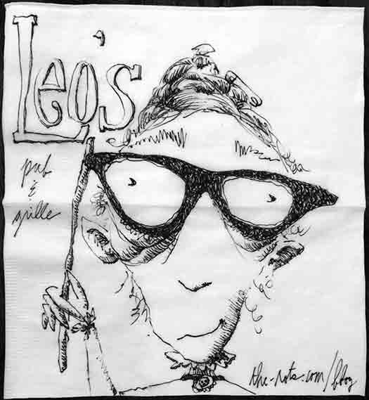
My napkin @ Leo’s Pub & Grille,
202 N Diamond St, Mount Pleasant PA.
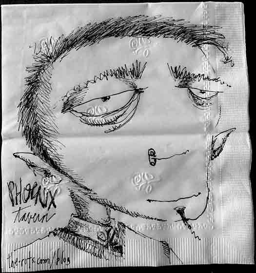
My napkin @ The Phoenix Tavern, 200 Broad Street Johnstown PA.
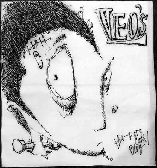
My napkin @ Leo’s Pub & Grille,
202 N Diamond St, Mount Pleasant PA.
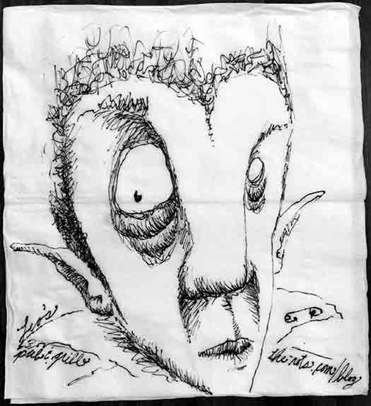
My napkin @ Leo’s Pub & Grille,
202 N Diamond St, Mount Pleasant PA.
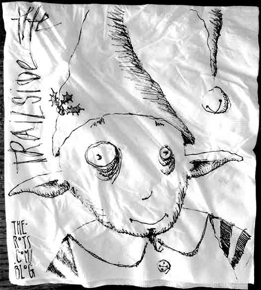
My napkin @ The Trailside, 108 W Main St, West Newton PA.
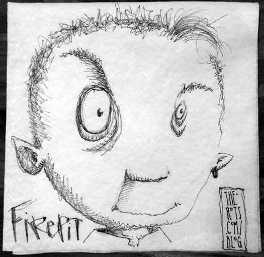
My napkin @ Firepit, North Huntingdon PA.
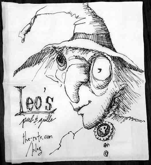
My napkin @ Leo’s Pub & Grille,
202 N Diamond St, Mount Pleasant PA.
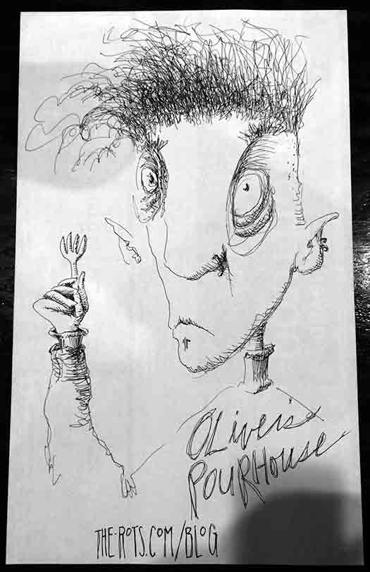
My place mat @ Oliver’s Pourhouse, 8 N Pennsylvania Ave, Greensburg PA.
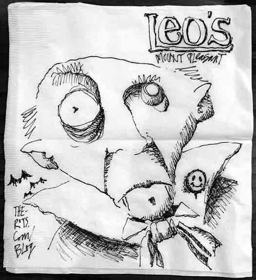
My napkin @ Leo’s Pub & Grille,
202 N Diamond St, Mount Pleasant PA.
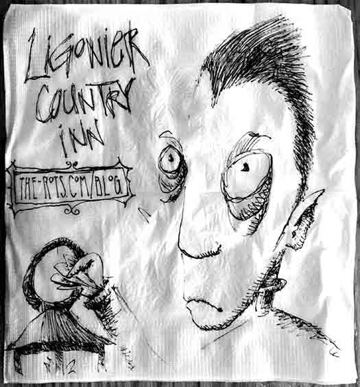
My napkin @ Ligonier Country Inn, 1376 Rt 30, Laughlintown PA.
Back in 2013 I was so excited about Halloween that I had this brilliant (*sarcasm*) idea of drawing a new Rot every day in October to share with my new Facebook friends. It was tough by the end, not just to come up with a new ideas, but to get them finished enough that I wouldn’t be embarrassed to post them in public. I had so much fun I decided to overwhelm myself again in 2014.
In 2015 I started a little earlier thinking that would help. I decided to make the drawings into a coherent series by drawing them all on either Strathmore Toned Tan or Toned Gray paper using pen and ink or colored pencils. Many of the drawings from the 2015 marathon made it into the exhibit that’s currently on display at the Southern Alleghenies Museum of Art in Ligonier.
I’m afraid doing it for three years means now I’m not allowed to stop.
This year, I pulled out an old sketchbook that I wasn’t doing anything with and decided to fill it with Halloween Rots. It’s a 5″x7″ Cachet spiral bound sketchbook with cream colored paper, and feels like a size that might not overwhelm me. My first plan was to draw each image just in pen and ink like the ones I do for the Restaurant Rots series. Pretty simple. Should be fine.
Then I had the brilliant idea to add something orange to each drawing.
It seems to have ballooned from there.
I dug into the markers and the colored pencils, and experimented until I figured out that the warm gray Faber-Castell Pitt Artist Pens and the French gray Prismacolor colored pencils looked best on the cream paper.
Found a new Prismacolor pencil called “Ginger Root” that looked similar to the tone of the paper, but a few shades darker which makes it great for light shading.
Ordered the 10% Warm Gray Pitt marker which turned out to be almost exactly the same color as the Prismacolor 50% French Gray which makes the part of me that needs to shade happy.
Prismacolor Mineral and Pumpkin Oranges.
Faber-Castell Dark Chrome Yellow, Terracotta and unnamed color 108.
I can see where this is going. I’m trying not to get overwhelmed. If this works it’s going to be so worth it.
I can do this.